
In the ZoodMall app, one of our core offerings was ZoodPay, a Buy Now, Pay Later (BNPL) service that let users split purchases into manageable installments. While adoption was growing, we noticed a major gap: a large portion of users weren’t engaging with the feature at all.
This wasn’t just a checkout UX issue, it pointed to deeper challenges around trust, product clarity, and alignment with local financial behaviors. To drive meaningful adoption, we knew we had to go beyond surface-level fixes and reframe how users understood and trusted ZoodPay.

We started seeing negative data signals...
Data Insights
High exit rates on the BNPL selection screen
Unusual time-on-page spikes, suggesting hesitation or confusion
So we investigated...
User Research
We conducted interviews and usability tests in the Uzbekistan market to uncover why users were dropping off:
Some users struggled to understand how the installment system worked, particularly the difference between the total purchase cost and the balance limit concept.
Others expressed skepticism and a lack of trust in the process: “What’s the catch? Will I be charged hidden fees?”
There was also anxiety around activating the spending limit: “I think if I don’t buy anything, I’ll still have to pay interest on the limit shown.”
In Uzbekistan, getting any kind of loan typically requires a visit to a bank branch. Because of this, many users were wary of financial services offered directly through a mobile app. They simply didn’t see it as legitimate or trustworthy.
Product, Business and Design teams brainstorming
When the product team brought this challenge to us, I immediately organized brainstorming sessions to gather diverse perspectives and align on the problem. It was a key opportunity to demonstrate the value of our team across the organization while fostering a culture of collaboration and trust.
We held multiple open sessions to explore ideas, dig into the root causes using existing data and research, and identify gaps in our understanding. Our goal was to surface the insights we were missing in order to confidently define a clear direction forward.
Our users are...
Less experienced with technology compared to competitor’s
Unbanked or underbanked
Less familiar with financial products and concerned about hidden fees or loans


The result of the design thinking workshop comes down to testing 3 main ideas
Educating the user by offering value first
Simplification of the limit concept
Showing limits and additional information transparently on demand
What was working for our competitors?
AfterPay
Super fast account creation and limit activation
1 Limit + 1 explanation = 1 mental model
2 Features → Shop and Afterpay (showing only what is available and what is owed)
Always reminding users that they have a balance they can spend

Klarna
No limit at all
1concept → Shop and pay in 4
Simple navigation: Shop, Saved items and Money management

Validating our decisions
Based on our research, it became clear to me that the way we were communicating the BNPL feature was misaligned with user expectations and trust triggers. We were positioning the product around “The Limit”, which, while accurate from a financial perspective, felt abstract, and even intimidating to many users. For some, it resembled a loan offer, which triggered skepticism and fear of hidden fees or unintended debt.
To validate our hypothesis, I decided to run an A/B test comparing two versions of the ZoodPay onboarding experience:
Version A (Control): Focused on communicating the available spending limit

Version B (Variant): Focused on the core benefit: Unlocking the installments service

Test result
Version B outperformed the control by 51% in user engagement with the BNPL feature. More users opted in when the value was framed around flexibility and affordability, rather than credit limits or financial terminology.
Even more importantly, this shift in communication had a direct impact on business outcomes: approved transactions increased by 31%, indicating not just interest, but actual conversion and product usage.
This validated our insight that the original messaging was a key barrier. By reframing the offer around what truly matters to users, we were able to build trust, reduce friction, and drive measurable growth.
Version A results
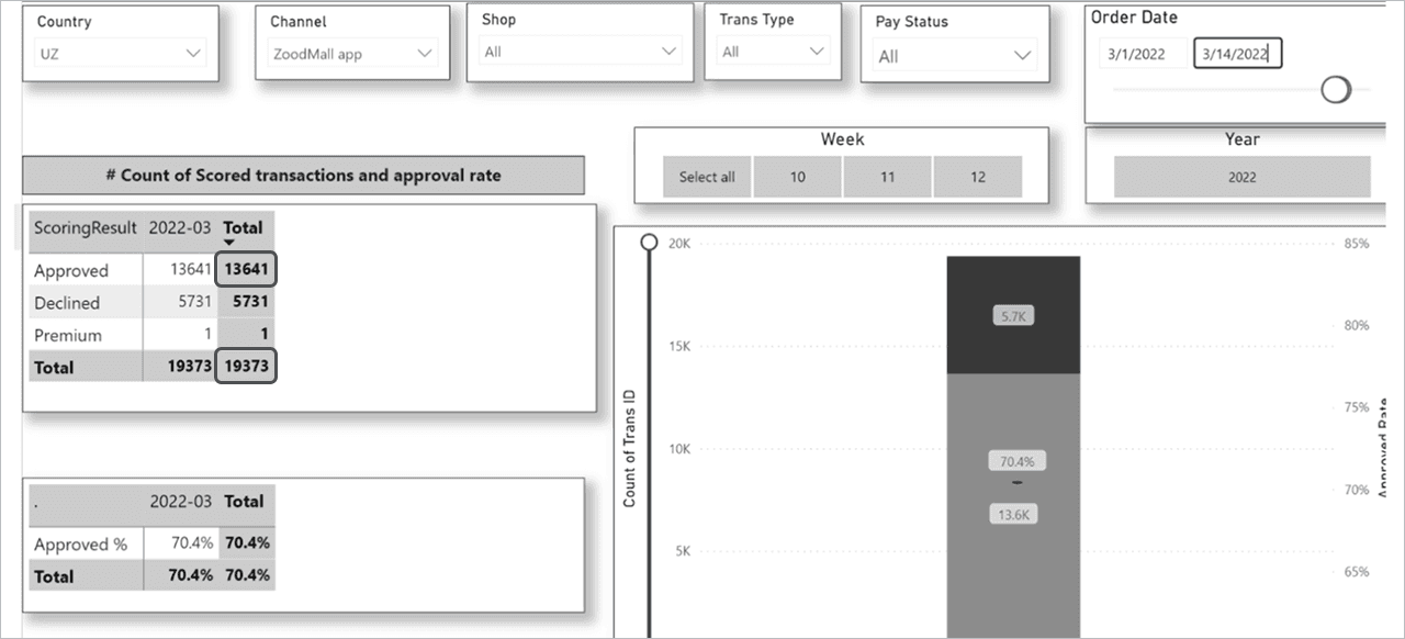
Version B results

Designing with Strategic Intent
This experiment was more than just a messaging tweak. It reflected a broader shift in how I approached product experience at Zoodmall. My goal was never just to optimize individual touchpoints, but to shape a cohesive, intuitive journey that built trust, empowered users, and reduced friction at every step. As the foundation for that experience, I leaned into three key UX principles that guided my approach across the app:
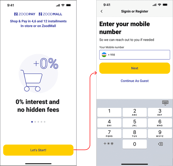
Onboarding from the Start
At the time, users would download the app and immediately start browsing products, with little to no introduction. I believed user education should begin from the first interaction. By surfacing core features like ZoodPay early and guiding users through onboarding, I aimed to build familiarity and trust right from the start.
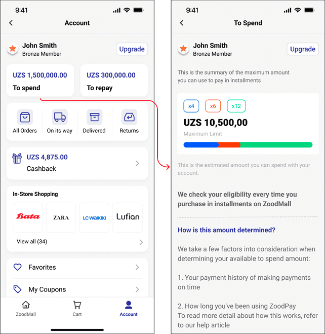
Focusing on Possibility, Not Limitation
I made a conscious effort to shift the tone of the experience from restrictive to empowering. Focusing on what users could do rather than highlighting limitations or eligibility criteria upfront. This was especially important in a financial context, where trust and clarity are critical.
Reducing Complexity Across the App
As part of a larger simplification effort, I advocated for reducing the number of navigation tabs and lowering cognitive load throughout the app. ZoodPay, in particular, didn’t need to live in its own silo — I saw an opportunity to integrate it more seamlessly into the shopping experience, making it feel like a natural extension of the user journey.
Ultimately, this experiment validated more than a UX insight. it reinforced my strategic direction for the product: to create a Zoodmall experience that was unified, intuitive, and centered around what users truly valued.